Create a dashboard
From Dashboards, click + Add dashboard. The Create dashboard modal offers two routes to the same object.
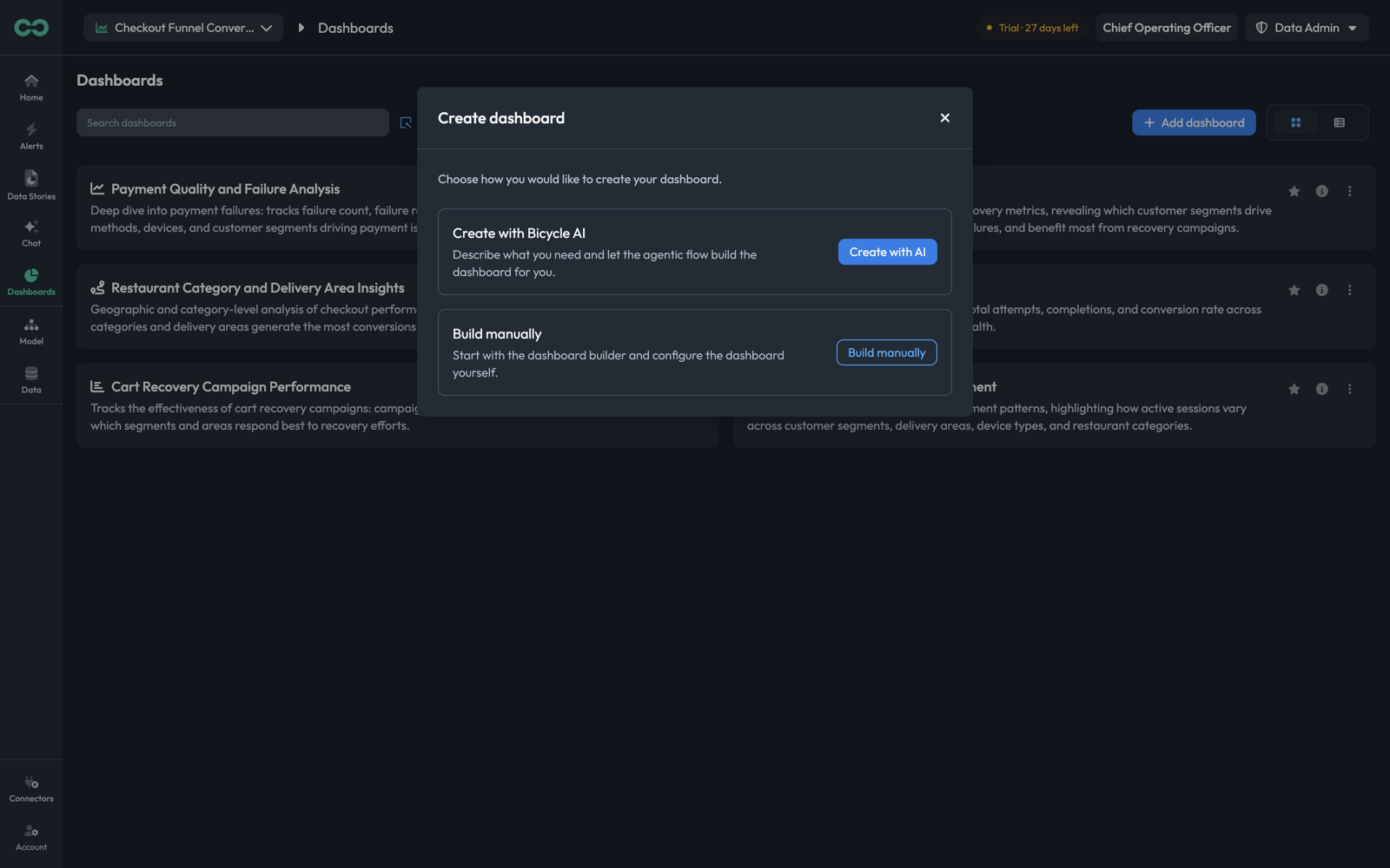
| Route | How it works | Best when |
|---|---|---|
| Create with Bicycle AI | Describe what you need and the agent assembles the widgets, picking the KPIs and breakdowns. | You know the business question and want a starting layout rather than a blank canvas. |
| Build manually | Start with an empty dashboard and add widgets yourself. | You know exactly which chart you want, or you are reproducing an existing layout. |
Both land in the same editor, so this is a choice about where you start, not what you end up with.
Create with a prompt
Create with AI opens a prompt page with generated ideas for this use case.
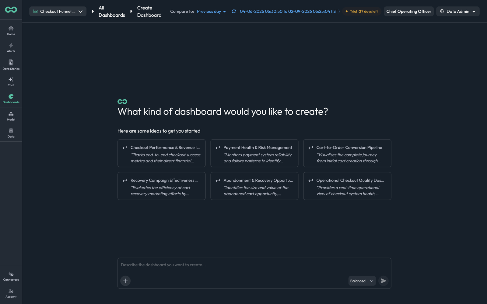
Each idea card carries a full prompt — "Tracks end-to-end checkout success metrics and their direct financial impact, showing conversion efficiency alongside actual revenue generated from completed orders." Clicking one runs it; the composer at the bottom takes your own.
A prompt that produces a usable dashboard names the metrics and the cuts, not just the topic:
| Instead of | Write |
|---|---|
payments | Payment failure rate and failed payment count, broken down by payment method and device type |
conversion | Checkout conversion rate over time with attempts and completions, split by customer segment |
The mode selector beside the send button sets how much reasoning to spend. It behaves the same way as in Chat — Fast for a direct build, Balanced by default, High for a layout that needs the agent to work out which metrics relate to which.
Build manually
Build manually opens an empty dashboard in edit mode. The same edit mode is what Edit gives you on an existing dashboard.
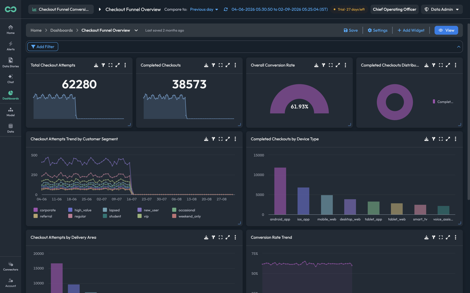
| Control | What it does |
|---|---|
| Save | Writes the layout. Nothing is persisted until you click it |
| Settings | Dashboard-level settings — name, description, defaults |
| + Add Widget | Opens the widget-type picker |
| View | Leaves edit mode |
| Add Filter | Adds a filter applied across every widget on the dashboard |
Widgets can be dragged to reposition and resized from the handle in their bottom-right corner.
Adding, moving, resizing, and deleting widgets are all local until Save. Leaving with View or navigating away discards them — which is also the safe way to back out of an experiment on a shared dashboard.
Adding a widget
+ Add Widget opens the picker: a Popular Widgets row and the full All Widgets set.
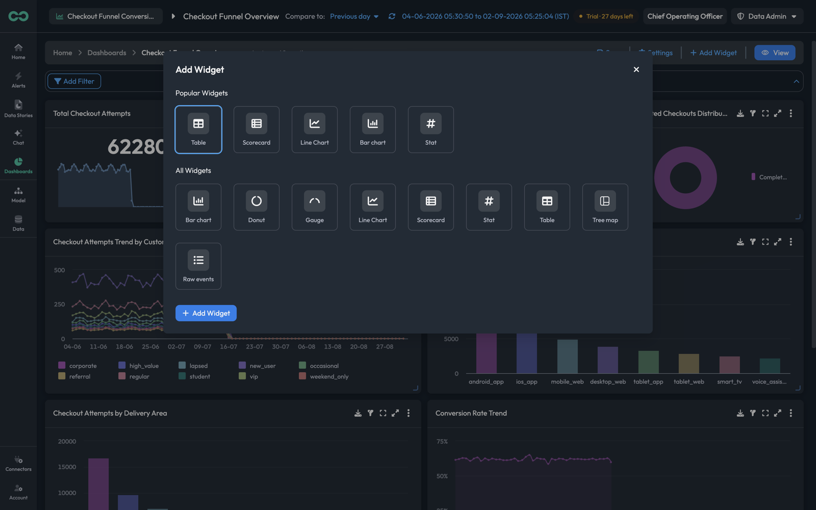
Select a type, then + Add Widget. The widget lands on the dashboard, and its type can still be changed later in the editor — picking here is a starting point, not a commitment. For what each type is for, see Widget types.
The widget editor
A widget's kebab → Edit opens the editor: configuration on the left, a live preview on the right.
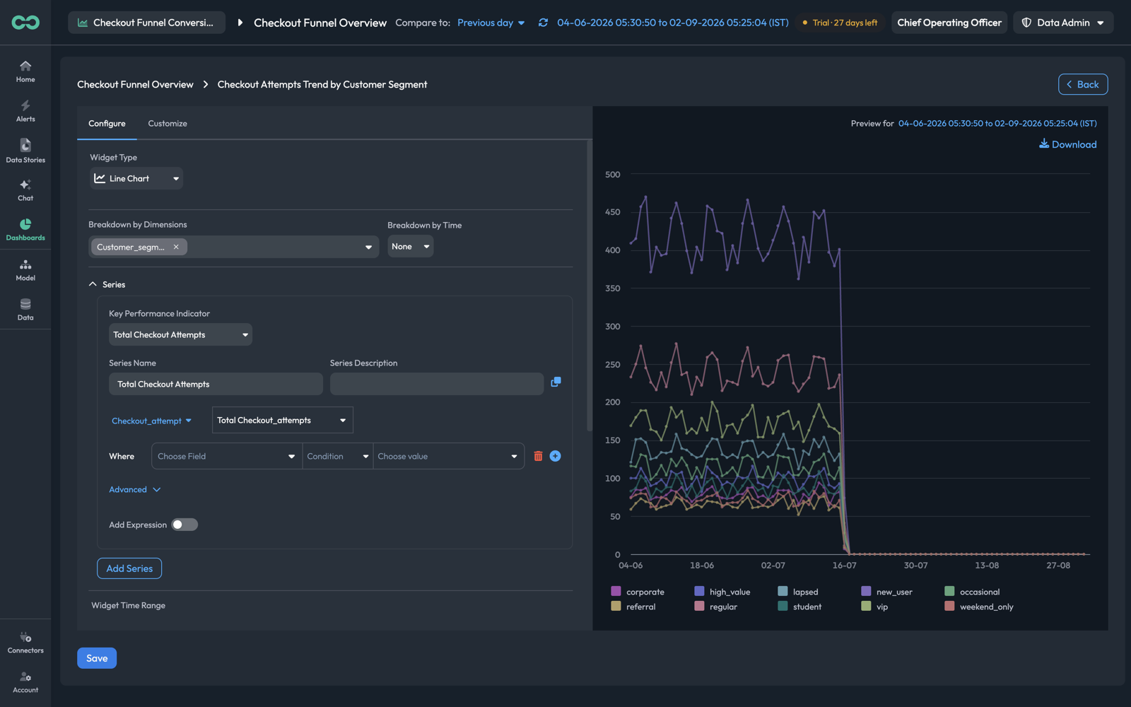
The preview re-runs as you change fields and states the window it is rendering — "Preview for 04-06-2026 to 02-09-2026 (IST)". Download exports what it is showing.
Configure
Widget TypeThe visualization. Changing it here re-renders the same series differently, so a bar chart that would read better as a table is a one-field change.
Breakdown by DimensionsThe dimension to split the series by — one line or bar per value. Multi-select; leaving it empty gives a single aggregate series.
Breakdown by TimeThe time bucket — or None to leave the series unbucketed.
Series
Each series is one measurement, and a widget can hold several via Add Series.
Key Performance IndicatorThe KPI this series measures. Selecting one fills in its event type and aggregation below.
Series NameThe label in the legend and tooltips. Defaults to the KPI name; worth shortening when a chart carries several series.
Series DescriptionOptional context on the series.
WhereFilter rows narrowing this series — Choose Field, Condition, Choose value — with + to add another. Filters here apply to this series only.
Add ExpressionTurn on to build the series as a formula over named metrics rather than a single KPI, the same way a ratio KPI is defined. See Expressions.
Advanced expands further options on the series.
Attempts and completions on one line chart makes the gap between them visible. As two adjacent widgets, the reader has to do the comparison themselves — and separate y-axes will usually mislead them while they try.
Widget time range and refresh
Below the series:
Widget Time RangeDefault: Dashboard DefaultOverride the dashboard's window for this widget alone. The field notes it directly: the selected range "will override dashboard's default time range for this particular widget".
Compare withDefault: NoneA comparison period for this widget, independent of the dashboard's Compare to.
Apply Additional ProjectionAn extra projection over the result.
Auto refresh data everyDefault: Dashboard DefaultHow often this widget re-queries, with Max Time Period bounding how much it pulls.
Widget FiltersFilters on the widget as a whole, applied on top of each series' own Where rows.
Customize
The Customize tab holds presentation, separate from what the widget measures.
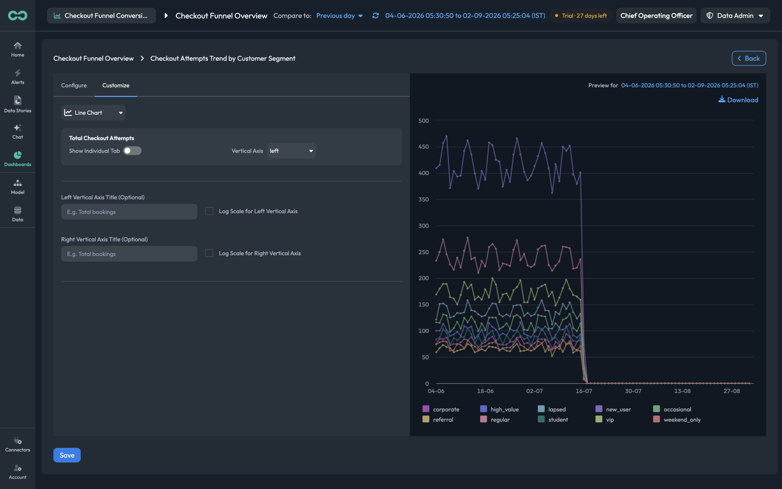
Show Individual TabGive the series its own tab within the widget, rather than plotting it alongside the others.
Vertical AxisPut the series on the left or right axis. This is the fix for two series whose magnitudes differ by an order of magnitude — a count and a percentage on one axis makes the smaller one flat.
Left / Right Vertical Axis TitleOptional axis labels. Worth setting whenever you have used both axes, since otherwise the reader cannot tell which line belongs to which.
Log Scale for Left / Right Vertical AxisLog-scale either axis, for series spanning several orders of magnitude.
Save on the widget editor returns you to the dashboard — still in edit mode, still unsaved. Save on the dashboard is what persists it.
Things to know
- Two saves. The widget editor's Save and the dashboard's Save are separate. Saving the widget and then navigating away loses it.
- An empty chart is usually the window, not the query. If a widget renders "No data to display", check the dashboard's time range against the period your data actually covers before rebuilding the series.
- Widget overrides win. A widget with its own Widget Time Range ignores the dashboard picker — including when someone else changes it and wonders why one card did not move.
- Clone before you experiment. A widget's Clone gives you a copy to modify, which is cheaper than reconstructing the original if the change turns out worse.
- Prompt first when the metrics relate to each other. The prompt route picks up the relationships in your KPI tree, which is exactly the part that is tedious to assemble by hand.
Next: Chat — asking a question directly instead of building a dashboard for it.