Data Stories overview
A data story is a standing analysis that produces a written report and a slide deck — Payment Failure Root Cause Analysis, Checkout Funnel Drop-off Analysis, Cart Recovery Campaign Effectiveness.
Chat answers one question. A dashboard shows numbers and leaves the interpretation to the reader. A data story is the third thing: the recurring review someone would otherwise write by hand every Monday — findings, evidence, root causes, and recommendations, assembled and delivered on a schedule.
Data stories live under Data Stories, scoped to one use case.
A definition and its runs
The distinction that makes everything else make sense: a data story is a definition, and each execution of it is a run. Two tabs, one for each.
All stories — the definitions
The standing analyses: what to investigate, how, and in what output format. You edit these. Each shows how many runs it has produced.
Runs — the outputs
What each execution actually found. A run is a point-in-time artefact with a headline, a report, and a deck. You read these.
All stories
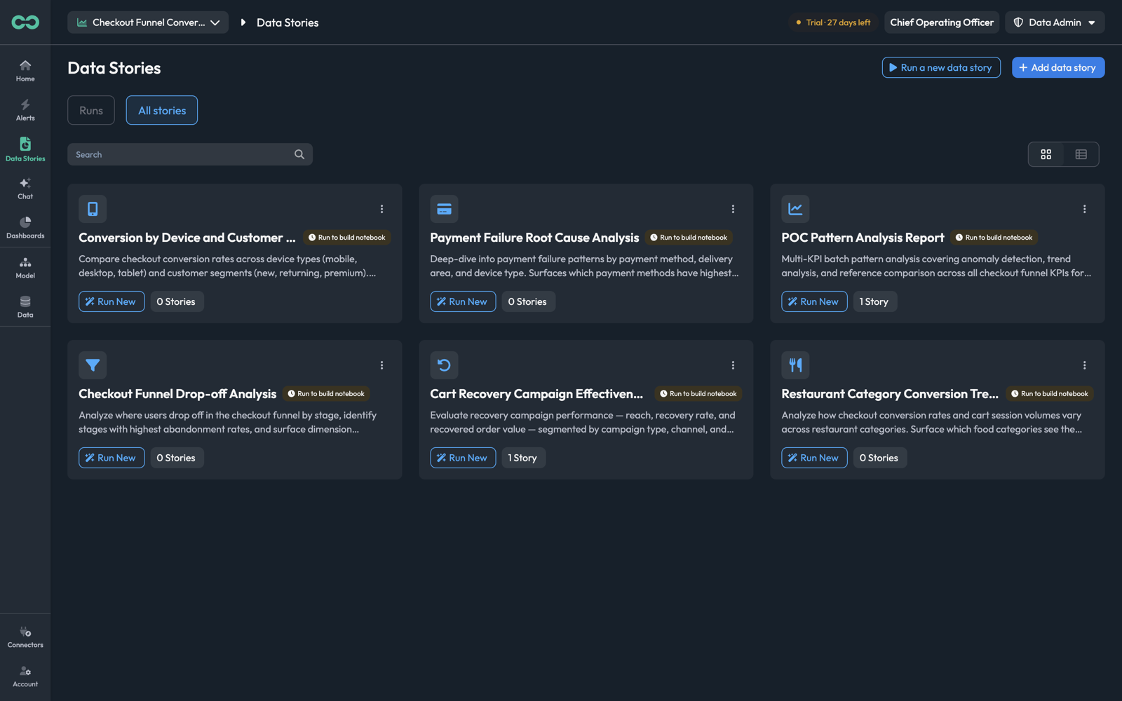
Each card is one definition: an icon, its name, a description of what it investigates, Run New to execute it now, and a count — 1 Story, 0 Stories — of the runs it has produced. The Run to build notebook badge marks a definition that has not yet been executed.
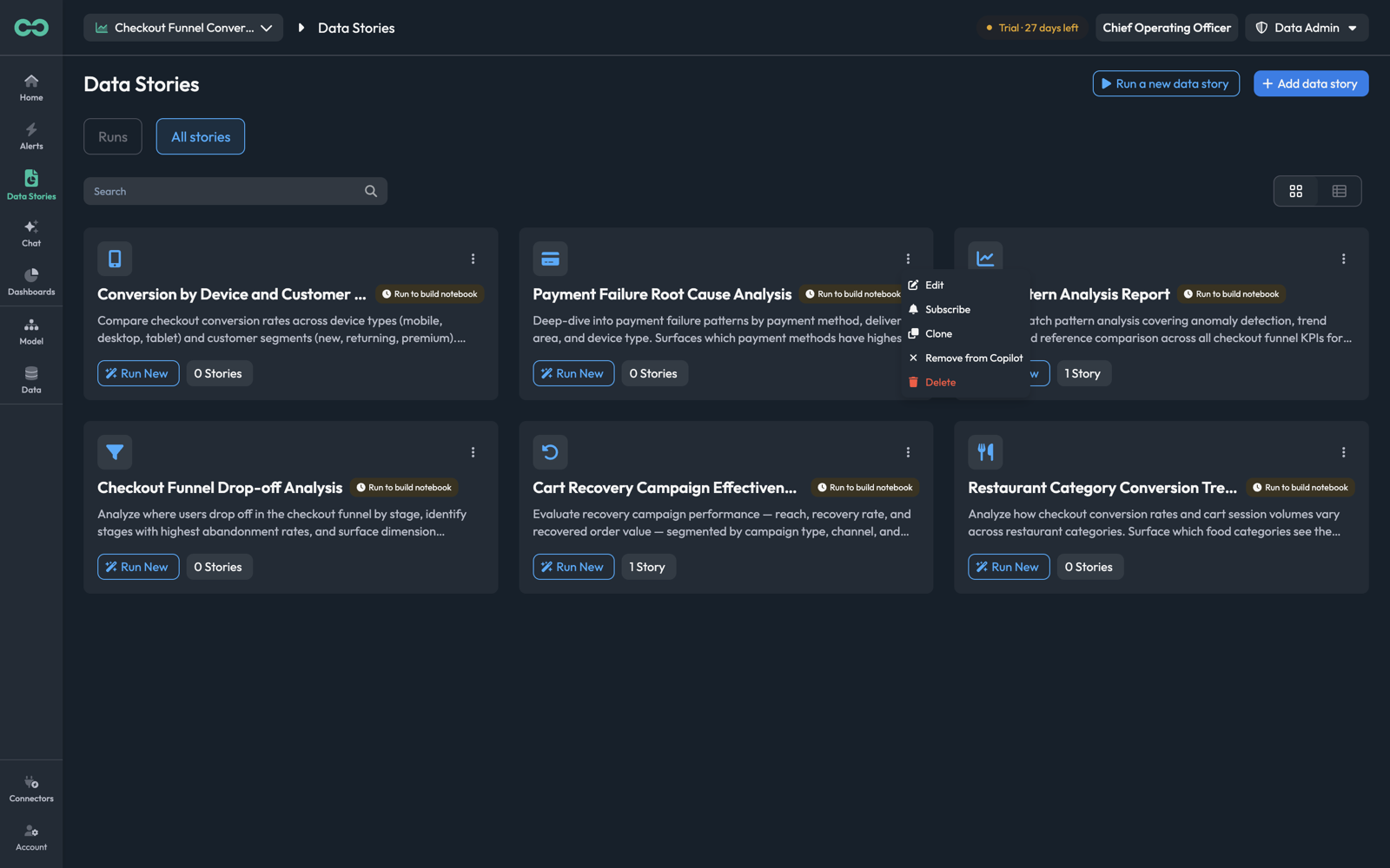
The kebab menu on each card:
| Item | What it does |
|---|---|
| Edit | Opens the five-step definition wizard — see Create a data story |
| Subscribe | Schedules recurring runs and email delivery — see Subscriptions |
| Clone | Copies the whole definition, including its prompt and parameters |
| Remove from Copilot | Stops the story being offered by the agent, without deleting it |
| Delete | Removes the definition |
Clone is the one to reach for most. Definitions carry a long system prompt written against your specific KPIs and dimension names, and adapting a copy is much less work than writing one from scratch.
Runs
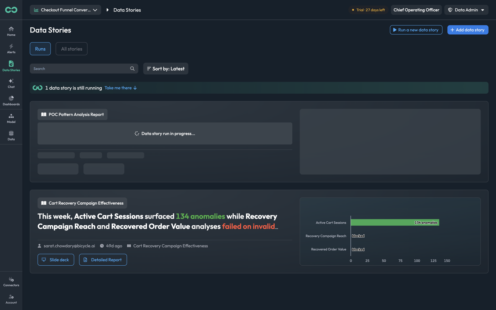
Each run card shows the definition it came from, the headline the run generated, who ran it, how long ago, and buttons for its two outputs — Slide deck and Detailed Report. A chart summarising the finding sits alongside.
Above the list, Search filters by name and Sort by orders the runs. A banner appears while anything is executing — "1 data story is still running" — with Take me there to jump to it.
The headline is the part to read first. It is a claim, not a title: "This week, Active Cart Sessions surfaced 134 anomalies while Recovery Campaign Reach and Recovered Order Value analyses failed on invalid dimensions." Note that this one reports its own partial failure — a run tells you what it could not do as well as what it found, and a headline mentioning invalid dimensions is pointing at your model, not at the data.
Core concepts
Data storyThe definition: name, description, system prompt, workflow, output format, and parameters.
System promptThe domain knowledge the analysis runs against — business context, KPI definitions, and the exact dimension names to use. This is the substance of a definition. See Define.
WorkflowThe stages a run works through, from loading context to delivering output. Generated by Bicycle from the definition and reviewable before you run. See Workflow.
RunOne execution, with its own parameter values, headline, report, and deck.
ModeHow much analysis a run performs — Quick, Balanced, or Detailed. Set per run.
Input variableA parameter the run takes — an analysis date, a list of payment methods to include, a threshold. Declared on the definition, supplied per run. See Input variables.
SubscriptionA schedule plus recipients, so runs happen and arrive without anyone clicking. See Subscriptions.
The three views of a run
Every definition targets one or both output formats, chosen in the wizard:
| Format | What it is | Read it when |
|---|---|---|
| Report — Document Pages | The full written analysis, paginated with a table of contents | You are the one who has to act on it |
| Slides — Presentation | The same findings condensed into a deck | You are presenting it to someone who was not investigating |
| Both — Report + Slides | Both, from one run | The usual choice, and the default |
A completed run opens with tabs across the top — Slides, Report, and Causes — and a headline that is a finding rather than a title: "UPI Timeout Spike, Conversion Resilient."
Slides
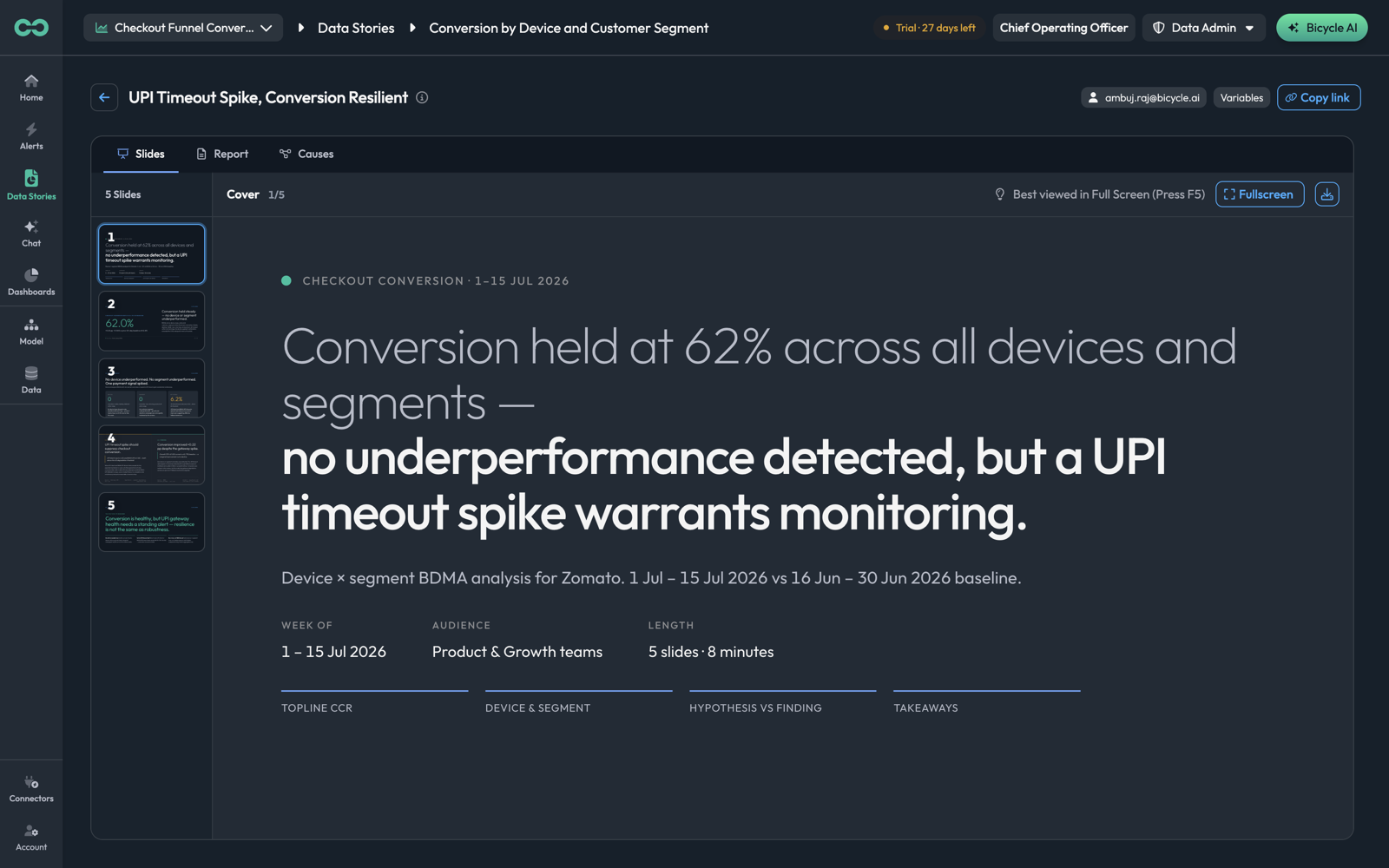
Thumbnails down the left, the current slide in the pane, and a slide counter. The cover slide states the window, the audience, and the length — "5 slides · 8 minutes" — then names the sections that follow. Fullscreen presents it, and the download icon exports it.
Report
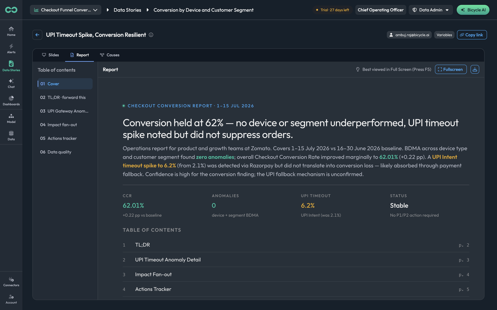
The same run as a paginated document. The cover carries the headline, an abstract, the run's headline figures as a stat row — CCR 62.01%, Anomalies 0, UPI Timeout 6.2%, Status Stable — and a table of contents. The left rail navigates the pages.
Note what the abstract does with uncertainty: "Confidence is high for the conversion finding; the UPI fallback mechanism is unconfirmed." A report separates what it established from what it inferred, and the second half is the part to read before acting on it.
Causes
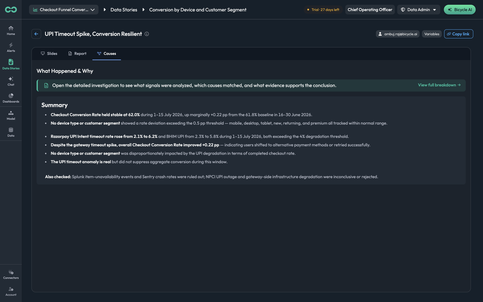
What Happened & Why — the investigation behind the findings, with View full breakdown for the detail: which signals were analysed, which causes matched, and what evidence supports the conclusion.
The Also checked line at the bottom is the most useful sentence in a run and the easiest to miss: "Splunk item-unavailability events and Sentry crash rates were ruled out; NPCI UPI outage and gateway-side infrastructure degradation were inconclusive or rejected." It tells you which explanations were tested and dismissed — so you do not spend the afternoon checking them again.
Where to go next
- Create a data story — the five-step definition wizard
- Run and subscribe — running one now, and scheduling delivery
- Chat — for a one-off question that does not need a standing analysis